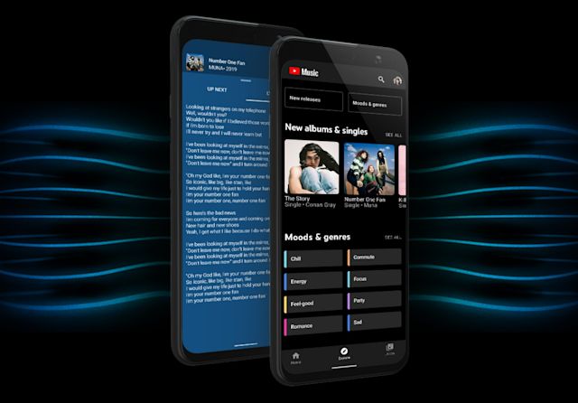
Starting today,Google is rolling out a new "Explore" tab to the YouTube Music mobile app. The Hotlist section the new tab is replacing had mostly highlighted music videos that were trending on YouTube at the time. By contrast,Google designed its replacement to help you find new music.
The tab is divided into two sections. Underneath the first,you'll find new albums,singles and music videos to stream. As you might have expected,YouTube will highlight what tracks you should check out based on your listening history. Down the screen,you'll see a showcase of YouTube Music's playlists.
Google has organized this part of the tab by moods and genres,so you'll see headings like "chill," "commute" and "focus." In a lot of ways,the interface here is reminiscent of Spotify's recent Home tab redesign in its use of color coding and square icons.
In March,Google updated YouTube's mobile app to add an Explore tab to it as well. In the past,the company's different apps haven’t always been consistent with one another. So it's nice to see at least the YouTube apps align.
In recent months,Google has also accelerated the pace at which it’s added new functionality to YouTube Music,building out features that were previously missing. The Hotlist was one of the last holdovers from the app’s less functional days. Moving forward,Google says it'll introduce additional discoverability features and enhancements to the tab. The company is rolling out the new section to users gradually,so as usual,it may take a couple of days before you can check out the Explore tab for yourself.


 加载中,请稍侯......
Comments